The Map Of… Everything!*

This “Histomap,” created by John B. Sparks, was first printed by Rand McNally in 1931. It is now housed by The David Rumsey Map Collection and they, thankfully, host a fully zoomable version here online.

20130816-082635.jpg

This giant, ambitious chart fit neatly with a trend in nonfiction book publishing of the 1920s and 1930s: the “outline,” in which large subjects were distilled into a form comprehensible to the most uneducated layman.

The 5-foot-long Histomap was sold for $1 and folded into a green cover, which featured endorsements from historians and reviewers.

* “World” being highly subjective. History being “4,000 years”.

Wicked Sick Map!

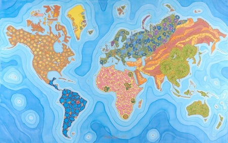
Illness and death are the common lot of humanity, but just how they get you depends in part on where in the world you live. This artwork makes that point by combining the beauty of microscopy with the geography of disease. Each continent is painted as microscopic views of the parts of the body that, when diseased or dysfunctional, cause most death or illness for the people who live there.

North America is built from fatty adipose tissue because of its epidemic of obesity. Europe and Russia is represented by brain tissue, representing the neurodegenerative disease of its ageing population. East Asia and the Pacific region is shown as pancreatic tissue, which when diseased causes diabetes. Greenland is marked by a few sperm cells that represent infertility.

The artist, Odra Noel, trained as a doctor, and uses her knowledge of organs and tissues, cell structure and mitochondria in her work. She says she painted this work on silk to evoke old maps.

The disease map of the world is on show from 2 July at the Royal Society’s Summer Science Exhibition in London. This festival of science and technology presents exhibits covering everything from acoustic thermometry to zebrafish genetics.

Image: Odra Noel/Scientific Art / odranoel.eu
© NewScientist.com TYVM

20130627-152424.jpg

Mercury’s Volcanoes

20120329-134348.jpg

Picture: NASA / JHUAPL / CIW-DTM / GSFC

This color-coded perspective view shows elevations in the ancient volcanic plains that lie the northern high latitudes of Mercury, as revealed by NASA’s Messenger spacecraft. Purple colors are low and white is high, spanning a vertical range of about 1.4 miles (2.3 kilometers).